Angular Beam 1.1.0


The beam is currently a release candidate. We will be collecting feedback before a full production-ready release is made.
Changes and improvements
New styling
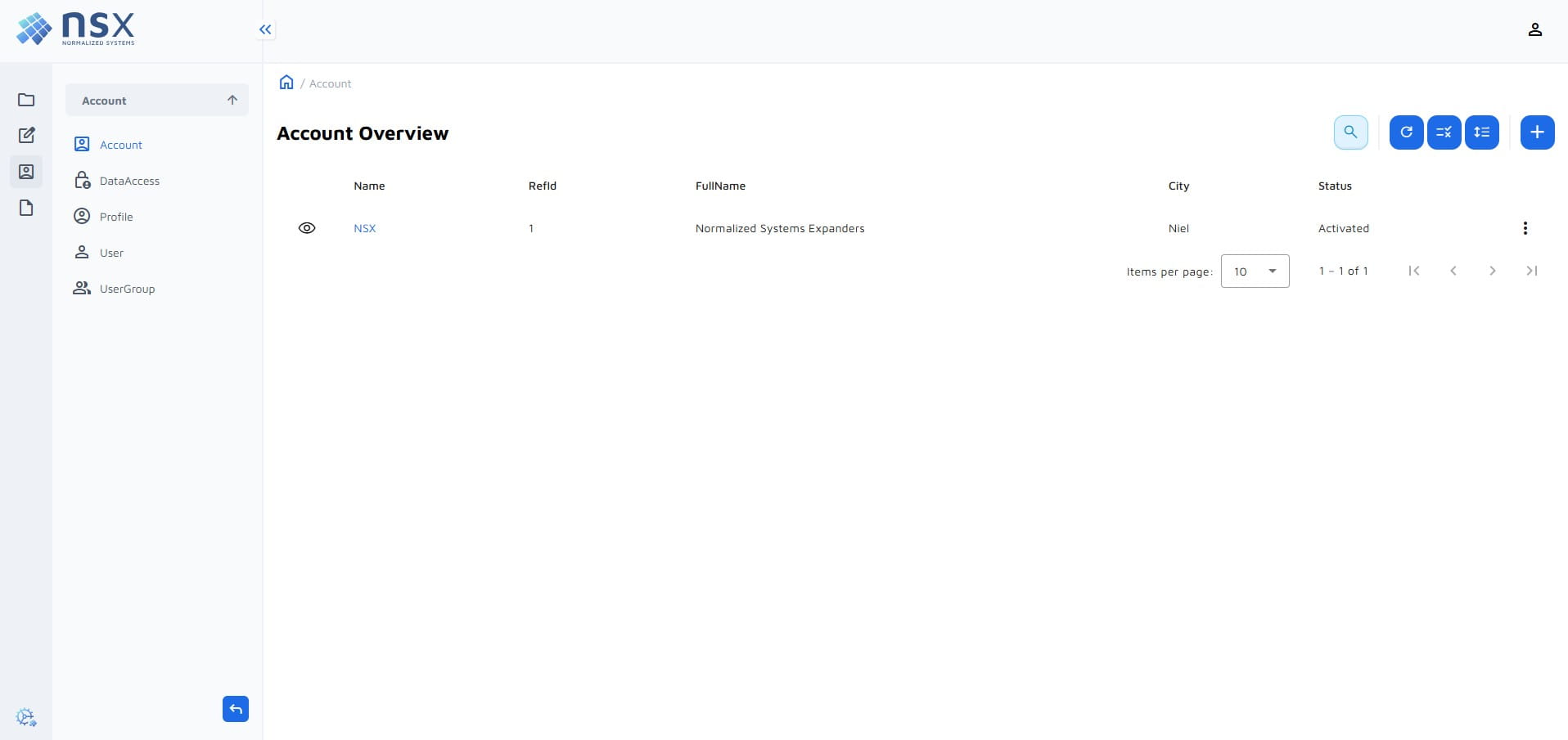
The @nsx/ngx-ns-core runtime library was updated to version 4.5.0. The expanded CRUD pages got a refreshed look:
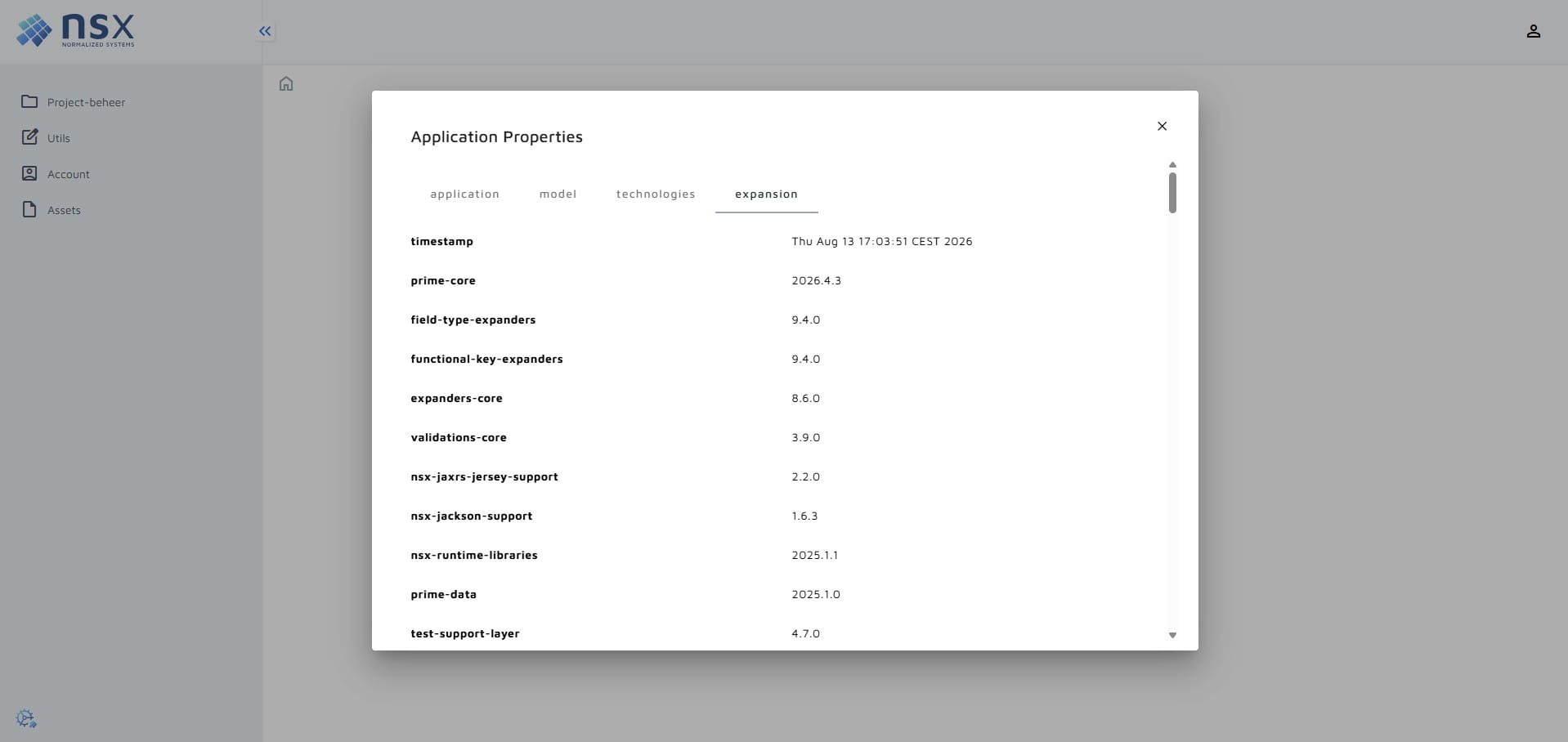
- Add/edit forms, detail views, the user page and the application properties dialog get a light background, padding and rounded corners.
- Table cells no longer wrap, so all rows have the same height. Values that do not fit are cut off with an ellipsis, the column can be resized to show more.
- Multi-link fields are shown as a comma-separated list in tables and details.
- BigStrings in detail views are cut off after 3 lines, with a button to show the entire value.
- The default titles of list and detail pages and the labels of data child tabs are easier to read (e.g.
Certification type overviewinstead ofCertificationType Overview). - DataChildren tabs on the detail views have a new look and display their content in a box. The first tab is also automatically opened.
The new styling is already present on the Expander Exchange
Faster builds
isolatedModulesandskipLibCheckare enabled in thetsconfig.json.- Component stylesheets only import the ngx-ns-core abstracts instead of the full library.
These changes lead to build times that are significantly faster and also reduce the bundle size. Several users have experienced build times that are twice as fast.
Sidebar menu groups
The sidebar menu now supports groups. The base feature modules (account, assets, utils, ...) are grouped under a base group in the default full menu config.
The collapsed state of the sidebar is now part of the menu service, so any component can collapse or expand the sidebar.
Filtering and searching
- Finders with the
InorNinoperator use a multi-select. - Finders with the
Lk(like) operator match values that contain the search text, the same as in Knockout. - The new
angular.defaultSelectedFilteroption on aDataViewpreselects a filter when the page opens. - The search bar is focused when a list page opens, and the first field of the filter form is focused when a filter is picked.
- The filter of a data child follows its parent, also when navigating between parents with the entry paginator.
- Multiple querySearches can be used in the frontend when using the standard-api.
Form field dependencies
The new angular.hasFormFieldDependencies option on a DataView expands a skeleton to easily define dependencies between form fields for the add and edit forms.
In combination with the angular-finder-expanders, the isLinkDriver option on a field is supported: when the driver field changes,
the link target field is cleared and its options are filtered with the finder from the option.
Support sorting on link fields
Sorting on link fields was already possible using the service-api, but it is now possible using the standard-api as well.
Requires standard-api-beam::2.1.0-rc1+ and jee-backend-beam::1.2.0-rc1+ (or minimal-jee-beam::2.7.0-rc1+)
Tables can be sorted on Ln02 link field columns. The sorting uses the name of the linked instance.
Authentication and authorization
- When the initial login with the identity provider fails, the user is navigated to the login page with an error instead of seeing a blank page.
- Data child tabs on a details page are hidden when the user is not allowed to see the list page of the child.
- Authorization denials are no longer cached when a request fails due to a connectivity error.
Migration guide
Migrate using AI
Copy the prompt below and let an AI agent do the heavy lifting. Keep in mind that you are still responsible for the migration so verify the migration yourself.
Update this project to the angular-beam::1.1.0-rc1. Update the expansionSettings and update the custom code. Take care to keep behavior the same. Mention any unexpected changes and changes that need to be made in feature anchors. You can use the migration guide at https://foundation.stars-end.net/docs/developer-hub/blog/angular-beam-1.1.0 for more info.
Versions
The angular-beam::1.1.0-rc1 requires:
net.democritus:base-components::2026.7.0or higher.net.democritus:querysearch-expanders::3.9.0or higher.
Both of these requirements can be satisfied by updating beams. See below on which versions you need to use.
- standard-api
- service-api
<expansionResources>
  ...
  <expansionResource name="org.normalizedsystems.beam:jee-backend-beam" version="1.2.0-rc1"/>
  <!-- or -->
  <expansionResource name="org.normalizedsystems.beam:minimal-jee-beam" version="2.7.0-rc1"/>

  <expansionResource name="org.normalizedsystems.beam:angular-beam" version="1.1.0-rc1"/>
  <expansionResource name="net.democritus.angular.stdapi:angular-stdapi-expanders" version="4.4.0"/>
  <expansionResource name="org.normalizedsystems.beam:standard-api-beam" version="2.1.0-rc1"/>
</expansionResources>
<expansionResources>
  ...
  <expansionResource name="org.normalizedsystems.beam:jee-backend-beam" version="1.2.0-rc1"/>
  <!-- or -->
  <expansionResource name="org.normalizedsystems.beam:minimal-jee-beam" version="2.7.0-rc1"/>

  <expansionResource name="org.normalizedsystems.beam:angular-beam" version="1.1.0-rc1"/>
  <expansionResource name="net.democritus.angular.svcapi:angular-svcapi-expanders" version="3.11.0"/>
  <expansionResource name="org.normalizedsystems.beam:service-api-beam" version="1.4.0-rc1"/>
</expansionResources>
Dependencies
The following npm dependencies are updated by the angular-expanders:
-    "@ngx-translate/core": "17.0.0",
-    "@nsx/ngx-ns-core": "3.0.0",
+    "@ngx-translate/core": "18.0.0",
+    "@nsx/ngx-ns-core": "4.5.0",
If your project uses @nsx/ngx-ns-charts, keep its version the same as the @nsx/ngx-ns-core version.
With @ngx-translate/core 18, getCurrentLang() can return undefined. Custom code that calls it may need a fallback, e.g. translateService.getCurrentLang() ?? ''.
Styling changes
The @nsx/ngx-ns-core runtime library was updated from version 3.0.1 to 4.5.0.
These changes contain styling changes and are automatically applied through the angular-expanders. You need to update custom styling to work with the new styling.
However, if you want to revert to the old styling you can follow these steps (keep in mind that this is custom styling, this will not be kept up-to-date and is not recommended):
- Include the
_legacy-3.0.1-theme.scssfile in your project at/src/styles/themes/_legacy-3.0.1-theme.scss - Use the theme in your
/src/styles/main.scss
- main.scss
- _legacy-3.0.1-theme.scss
/* --- themes --- */
@use 'themes/default-theme';
// @anchor:themes:start
// @anchor:themes:end
// anchor:custom-themes:start
@use 'themes/legacy-3.0.1-theme'; // Add this line
// anchor:custom-themes:end
@use '@angular/material' as mat;
@use 'sass:map';
@use '@nsx/ngx-ns-core' as ns-core;
@use 'default-theme';

// ngx-ns-core: opt-out of the UI changes introduced after 3.0.1
//
// Including this theme restores the look of ngx-ns-core 3.0.1 as closely as possible, mostly by
// providing values for the --nsc-custom-* variables. Include it after the ns-core themes:
//
//   @include legacy.theme($theme);
//
// All rules are prefixed with `html:root` so they win over the ns-core theme and component styles,
// regardless of the order in which the stylesheets are loaded.
//

// The info palette before it was replaced by the accent palette
$info-palette: (
  25 : #F5FBFF,
  50 : #F0F9FF,
  100 : #E0F2FE,
  200 : #B9E6FE,
  300 : #7CD4FD,
  400 : #36BFFA,
  500 : #0BA5EC,
  600 : #0086C9,
  700 : #026AA2,
  800 : #065986,
  900 : #0B4A6F,
  contrast: (
    25 : ns-core.$base-black,
    50 : ns-core.$base-black,
    100 : ns-core.$base-black,
    200 : ns-core.$base-black,
    300 : ns-core.$base-black,
    400 : ns-core.$base-white,
    500 : ns-core.$base-white,
    600 : ns-core.$base-white,
    700 : ns-core.$base-white,
    800 : ns-core.$base-white,
    900 : ns-core.$base-white,
  )
);

@mixin button($theme) {
  html:root {
    // Info buttons used the info palette instead of the accent palette
    --nsc-button--info-custom-color: #{map.get($info-palette, 600)};
    --nsc-button--info-custom-border-color: #{map.get($info-palette, 300)};
    --nsc-button--info-custom-background-active-color: #{map.get($info-palette, 200)};
    --nsc-button--info-custom-background-active-hover-color: #{map.get($info-palette, 300)};

    // Style type buttons used the 100 / 200 palette shades for their background
    @include style-type-background('nsc-button--info', $info-palette);
    @include style-type-background('nsc-button--warning', ns-core.$warning-palette);
    @include style-type-background('nsc-button--error', ns-core.$error-palette);
    @include style-type-background('nsc-button--success', ns-core.$success-palette);
  }

  // Style type buttons had a shadow
  html:root .nsc-button.nsc-button--info,
  html:root .nsc-button.nsc-button--warning,
  html:root .nsc-button.nsc-button--error,
  html:root .nsc-button.nsc-button--success {
    --nsc-button-custom-box-shadow: 0 -2px 0 0 rgba(10, 13, 18, 0.05) inset, 0 1px 2px 0 rgba(16, 24, 40, 0.05);
  }
}

@mixin style-type-background($button, $palette) {
  --#{$button}-custom-background-color: #{map.get($palette, 100)};
  --#{$button}-custom-background-hover-color: #{map.get($palette, 200)};
}

@mixin alert($theme) {
  html:root {
    // Info alerts used the info palette instead of the accent palette
    --nsc-alert-custom-info-color: #{map.get($info-palette, 500)};
    --nsc-alert-custom-info-background-color: #{map.get($info-palette, 100)};
    --nsc-alert-custom-info-border-color: #{map.get($info-palette, 200)};
  }
}

@mixin dialog($theme) {
  html:root {
    --nsc-custom-dialog-border-width: 0;
    --nsc-custom-dialog-actions-background: transparent;
    // Same as the default border of mat-dialog-actions
    --nsc-custom-dialog-actions-border-width: 1px;
    --nsc-custom-dialog-actions-border-color: transparent;

    // Restore the Angular Material defaults for the shape, shadow and max width of the dialog
    @include mat.dialog-base($theme);

    .mdc-dialog__container {
      border-radius: 0;
    }

    // The new backdrop style applied to every overlay backdrop, restore the CDK defaults
    .cdk-overlay-backdrop {
      background: none;
      backdrop-filter: none;
      -webkit-backdrop-filter: none;
    }

    .cdk-overlay-dark-backdrop {
      background: rgba(0, 0, 0, 0.32);
    }
  }

  html:root nsc-dialog {
    .dialog__header {
      min-width: auto;
      align-items: normal;
      padding: 0;
      gap: normal;

      .dialog__header__title-container.mat-mdc-dialog-title {
        align-items: normal;
        height: auto;
        padding: var(--mat-dialog-headline-padding);
      }

      .mat-mdc-dialog-title .dialog__title {
        margin: 1rem 0 0;
      }
    }

    .dialog__actions.mat-mdc-dialog-actions {
      padding: 0 24px;
      border-bottom-left-radius: 0;
      border-bottom-right-radius: 0;

      // Empty action bars were not hidden
      &:empty {
        display: flex;
        min-height: 52px;
        padding: 0 24px;
        border-top: 1px solid transparent;
      }
    }
  }

  // The cancel button of the confirmation dialog had no background
  html:root nsc-confirmation-dialog button:first-of-type {
    --nsc-button--no-background-custom-background-color: transparent;
  }
}

@mixin table($theme) {
  html:root {
    // The table had no background color of its own and no borders between the rows
    --nsc-custom-table-background-color: transparent;
    --nsc-custom-table-row-border-width: 0;
    --nsc-custom-table-row-border-color: transparent;
  }

  html:root nsc-table {
    // The table had the Angular Material background color
    @include mat.table-overrides((
      background-color: mat.get-theme-color($theme, background, card),
    ));

    // The header height did not follow the row height setting
    &.nsc-table__row--comfortable,
    &.nsc-table__row--normal,
    &.nsc-table__row--compact {
      @include mat.table-overrides((
        header-container-height: 56px,
      ));
    }

    // Header titles could wrap
    table.nsc-table.mat-mdc-table tr.mat-mdc-header-row:first-child th.mat-mdc-header-cell.mdc-data-table__header-cell {
      white-space: normal;
    }
  }

  // The header had the same background color as the table
  html:root .nsc-table {
    --nsc-custom-table-header-background-color: var(--nsc-custom-table-background-color, var(--nsc-table-background-color));
  }
}

@mixin tabs($theme) {
  html:root {
    // Tabs had no background, border or spacing of their own
    --nsc-custom-tab-background-color: transparent;
    --nsc-custom-tab-background-color-hover: transparent;
    --nsc-custom-tab-background-color-active: transparent;
    --nsc-custom-tab-text-color: currentColor;
    --nsc-custom-tab-text-color-hover: currentColor;
    --nsc-custom-tab-text-color-active: currentColor;
    --nsc-custom-tab-border-width: 0;
    --nsc-custom-tab-border-color: transparent;
    --nsc-custom-tab-border-color-active: transparent;
    --nsc-custom-tab-border-radius: 0;
    --nsc-custom-tab-container-background-color: transparent;
    --nsc-custom-tab-content-border: none;
    --nsc-custom-tab-content-border-radius: 0;
    --nsc-custom-tab-content-padding: 0;
    --nsc-custom-tab-gap-between: 0;
    --nsc-custom-tab-margin-bottom: 0;

    // The active tab had an indicator (underline)
    --nsc-custom-tab-indicator-display: flex;

    --nsc-custom-active-tab-label-color: #{mat.get-theme-color($theme, primary, 900)};

    // The Angular Material tab colors were included in the tabs theme
    @include mat.tabs-color($theme);

    mat-tab-nav-panel {
      max-height: 75vh;
    }

    .nsc-tab-container {
      padding: 1em 0 0 1em;
    }
  }

  html:root mat-tab-group,
  html:root nav {
    .mat-mdc-tab-links,
    .mat-mdc-tab-labels {
      padding: 0;
      width: auto;
    }

    // Angular Material defaults
    .mat-mdc-tab,
    .mat-mdc-tab-link {
      padding: 0 24px;
      height: var(--mat-tab-container-height, 48px);
      letter-spacing: var(--mat-tab-label-text-tracking, var(--mat-sys-title-small-tracking));
    }
  }
}

// Big strings are now cut off after 3 lines and can be expanded. Pass `true` to always show the full text.
@mixin details($theme, $full-big-strings: false) {
  @if $full-big-strings {
    html:root {
      --nsc-custom-details-max-collapsed-line-height: none;
      --nsc-custom-details-max-expanded-line-height: none;
    }
  }

  // Detail containers had a white background
  .detail-container {
    background-color: white;
  }
}

@mixin theme($theme, $full-big-strings: false) {
  @include button($theme);
  @include alert($theme);
  @include dialog($theme);
  @include table($theme);
  @include tabs($theme);
  @include details($theme, $full-big-strings);
}

@include theme(default-theme.$default-theme);
Data access
The legacy authorization mapping is now data driven. The <dataElement>-access-action-right-legacy-mapper.service.ts
and <dataElement>-view-action-right-legacy-mapper.service.ts services are no longer expanded. Instead, each feature module
expands one constants/<featureModule>-action-right-legacy-targets.ts file, and the operations are mapped in
core/constants/action-right-legacy-operations.ts. The resulting legacy rights are the same as before.
export const carActionRightLegacyTargets: ReadonlyMap<string, string> = new Map<string, string>([
  ['car.access.carBrand', 'benefits.carBrand'],
  ...
  // anchor:custom-legacy-targets:start
  // anchor:custom-legacy-targets:end
]);

export const carActionRightLegacyRights: ReadonlyMap<string, string> = new Map<string, string>([
  // anchor:custom-legacy-rights:start
  // anchor:custom-legacy-rights:end
]);
To migrate:
- Move custom code from the
custom-legacy-mapperanchor of the old services tocustom-legacy-rights(to map a full right) orcustom-legacy-targets(to map a prefix). - Custom code that injects one of the old
*ActionRightLegacyMapperServiceclasses should use theActionRightLegacyMapperServiceinstead. - Remove the old service files from your project.
Other changes:
- Access rights relating to a DataConnector now use the FeatureModule of the DataConnector. Check your data access configuration when a DataView uses a DataConnector of another FeatureModule.
- Data child tabs require the
canSeeFetchPageview right of the child data view. Check your data access configuration if child tabs are missing. AuthorizationService.isAuthorizedFor()rethrows connectivity errors (status0,502,503,504) instead of treating them as "not authorized". Custom code that subscribes to it directly should handle these errors.
Filter translations
Translations for filter fields are now specified per Finder or QuerySearch instead of in a shared filterFields block.
This prevents translation key collisions between filters. Custom translations should be updated:
-        "filterFields": {
-          "name": "Name",
-          "awardedTo": "AwardedTo"
-        },
+        "findByNameEq": {
+          "name": "Name"
+        },
+        "findByAwardedToEq": {
+          "awardedTo": "AwardedTo"
+        },
Advanced
SCSS import path of ngx-ns-core
The ngx-ns-core palettes, mixins and variables have moved to a separate entry. The expanded stylesheets now use:
- @use '@nsx/ngx-ns-core' as ns-core;
+ @use '@nsx/ngx-ns-core/abstracts' as ns-core;
Custom stylesheets that use @use '@nsx/ngx-ns-core' for palettes or mixins should change to @nsx/ngx-ns-core/abstracts.
The rich text editor styles are no longer part of @nsx/ngx-ns-core; they are included once in main.scss with @use '@nsx/ngx-ns-core/rich-text';.
Search bar
getSearchBarLabel()of the search bar coordinators now returns a translation key instead of the translated text. Custom code in theget-search-bar-label-*anchors should return a key and should not use theTranslateService.- Search bars and filters on a field with the
Lkoperator wrap the value in%. Custom code that adds the%itself, or reads the filter value and expects it without%, should be checked. - New model validations require that finder exists for a data child that has a search bar. Implement the necessary finders to solve these model validations if you encounter them.
Sidebar menu
MenuItem is now part of the new MenuEntry type, and the collapsed state of the sidebar moved from the LayoutComponent to the menu service.
- import { MenuItem } from '@nsx/ngx-ns-core/sidebar-menu'
+ import { MenuEntry } from '@nsx/ngx-ns-core/sidebar-menu'

 export interface Menu {
-  readonly menuItems: Signal<MenuItem[]>;
+  readonly menuItems: Signal<MenuEntry[]>;
+  readonly isMenuCollapsed: Signal<boolean>;

-  setMenuItems({menuItems}: { menuItems: MenuItem[] }): void;
+  setMenuItems({menuItems}: { menuItems: MenuEntry[] }): void;
   ...
+  toggleMenuCollapse(): void;
+  setMenuCollapsed({collapsed}: { collapsed: boolean }): void;
 }
Custom menu configurations, custom Menu implementations and custom code that uses LayoutComponent.isSidebarCollapsed should be updated.
User page
This only affects projects using Angular and the standard-api
The user page (account/pages/user/user-my-page) is now expanded by the account base feature module. It fetches the logged-in
user with the new /account/user/session/me endpoint of the base-components.
- The selector changed from
nsx-user-my-pagetoaccount-user-my-page. - Users need the
account.user.myuserdata access right to be able to access this endpoint.
Custom branding
This only affects projects using Angular and the standard-api
If the angularApp uses the angular.hasCustomBranding option, the image of the application properties button is no longer expanded.
To keep it, add the following harvest in application-properties-button.component.html:
<!-- anchor:custom-branding-application-properties:start -->
  <img src="assets/images/app-properties.svg"
       class="properties-icon"
       alt="properties-logo">
<!-- anchor:custom-branding-application-properties:end -->
You will need to provide the app-properties.svg asset yourself too and add it as an ext file.
Login validation
The custom-validate-login anchor in the auth service was placed after the return, so custom code in it never ran.
It now runs before the return. Check that existing custom code in this anchor still does what you expect.
TypeScript configuration
isolatedModules and skipLibCheck are enabled in the tsconfig.json. With isolatedModules:
- Re-exports of types need
export type. - A
const enumcan no longer be used from another file.
Removed legacy options
The following backwards compatibility options are removed. Remove them from your model and update custom code that depends on them.
| Option | Behavior now |
|---|---|
angular.legacy.table.useModelProjection | The table of a DataView always uses the Table projection. |
angular.legacy.tokens | The DataView related tokens are only available in <dataView>-view.tokens. |
angular.legacy.segment-parameter-mapper.generic | The specific FilterSegmentParameterMapper is always used. |
angular.legacy.data-access.error-handling.generic (service-api only) | The data access services always use the specific error handling. |
Filters with the In operator
Finders with the In or Nin operator now use a multi-select, and the filter field becomes a list.
-  profile?: Reference | null;
+  profileList?: Reference[] | null;
Custom code that uses the filter field or the form control should be updated. The related anchors are renamed as well,
e.g. custom-profile-validators -> custom-profileList-validators. Move custom code from the old anchors to the new ones.